Mobile traffic is more important in Shopify. In most sectors, 70-80% of Traffic is comes from smartphones. However, mobile is the biggest conversion barrier for an e-commerce website.
A Shopify store that is perfectly good on a computer but feels slow or cluttered, or unresponsive on a mobile device. It is quietly costing money every single day through a higher bounce rate, cart abandonment, and an increase in the cost of ads.
As stated on Google, “53% of mobile users abandon a website if its load time is over 3 seconds.”
This guide shows exactly how you can optimize your Shopify store for mobile, step-by-step, from design, speed, usability, Core Web Vitals, and real mobile user behavior.
Why Mobile Optimization is Important for Shopify Stores
According to Statista, mobile commerce sales will exceed the revenue of $2.5 trillion by 2025 and will be responsible for 40.4% of total online transactions. Optimizing Shopify for mobile is extremely important for online businesses.
Additional key reasons you should optimize your Shopify store for mobile use are:
- Google’s Mobile-First Indexing
- Higher Conversion Rate and Lower Bounce Rate
- The Impact of Mobile Shopping Trends
- Improved Customer Experience
Also Read:- How Shopify Themes Affect Website Speed
Step 1: Test Your Store on Real Mobile Devices (Not Just Tools)
This sounds obvious, but it’s skipped constantly.
Before making any changes, open your Shopify store on:
- A mid-range Android phone
- Older iPhone with an existing iPhone (not the latest one)
- Wi-Fi and mobile data connections
Be mindful of:
- How long does it take before you can tap anything?
- Whether the scrolling is smooth or jerky
- Time taken after clicking filters or variants
- Pausing between taps on “Add to Cart” and receiving a reaction
If it appears to be loaded but just doesn’t respond quickly, then that’s also a performance problem.
Tools help, but real devices reveal the truth.
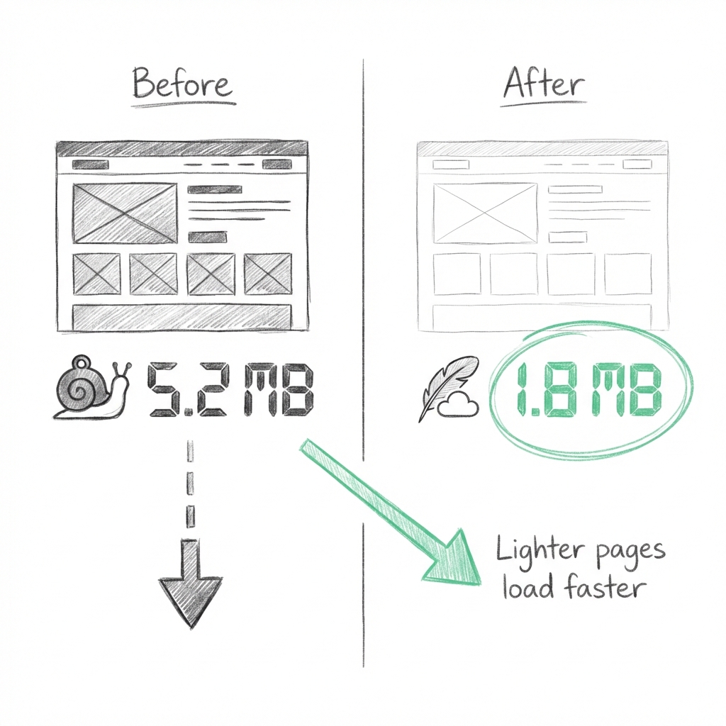
Step 2: Reduce Mobile Page Weight (This Is Where Speed Is Won)
On mobile, page size is one of the most influential factors.
Many Shopify stores quietly push 3-5MB pages to mobile users. That’s fine on desktop. On mobile, it’s a conversion killer.
The major contributors include:
- Oversized images
- Sliders and banners
- Multiple fonts
- JavaScript-heavy sections
As a general rule:
- If your mobile homepage is over 2MB, it needs work.
Reduction of page weight alone can cut off seconds of loading time without touching the theme logic.
Step 3: Optimize Images for Mobile First
Images are typically the heaviest elements on a Shopify page, especially on mobile.
This is often where most stores lose performance without even realizing it.
Common mistakes:
- Uploading desktop-sized images and letting the browser resize them
- Using background images instead of proper image tags
- Loading all the product images at once
- Relying on PNGs or JPGs when WebP is supported
What really works:
- Resize images to match real display sizes
- Use WebP wherever possible
- Enable native lazy loading
- Compress banners and hero images aggressively
- Avoid background image for main contents
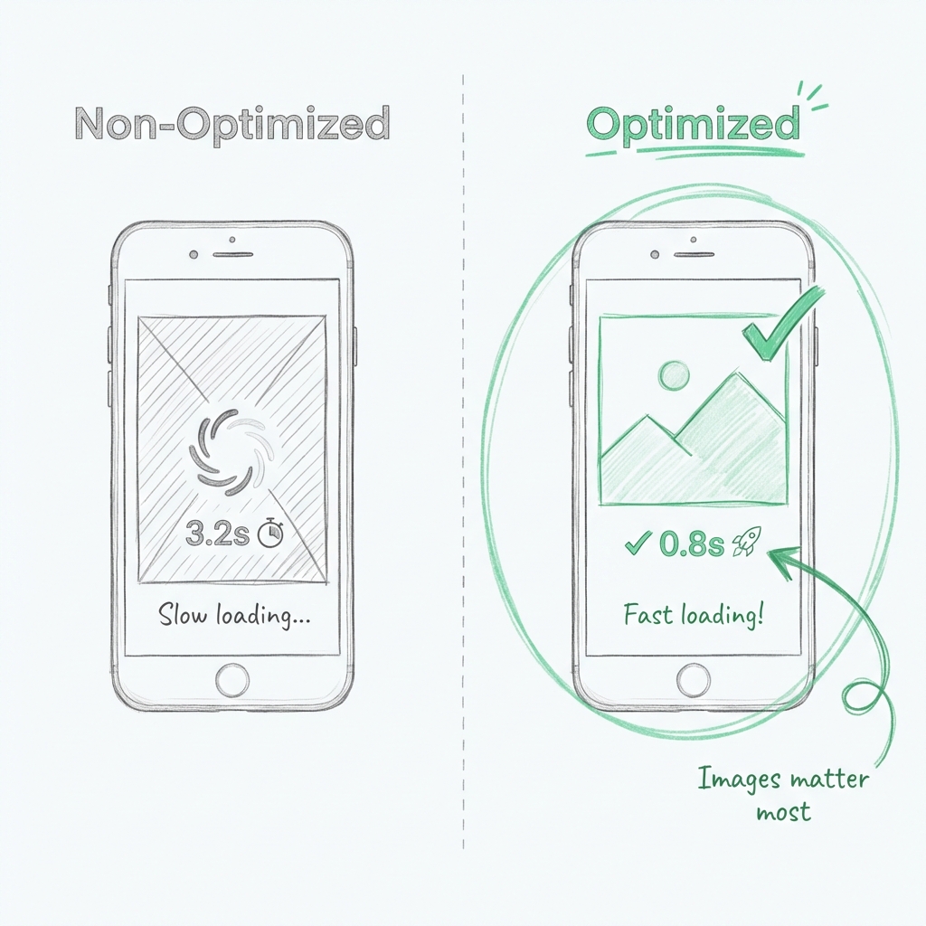
That’s not theory, that’s one of the fastest wins available.
Step 4: Strip Desktop-Only Features From Mobile
Most Shopify themes are still built desktop-first.
That means mobile users often get:
- Desktop animations
- Large sliders
- Hover effects translated poorly to touch
- Scripts that don’t make sense on phones
If a feature only exists for desktop aesthetics, loading it on mobile is wasted time.
Mobile optimization means:
- Disabling desktop-only sections on mobile
- Reducing the use of animations
- Reducing animation usage
- Removing visual clutter
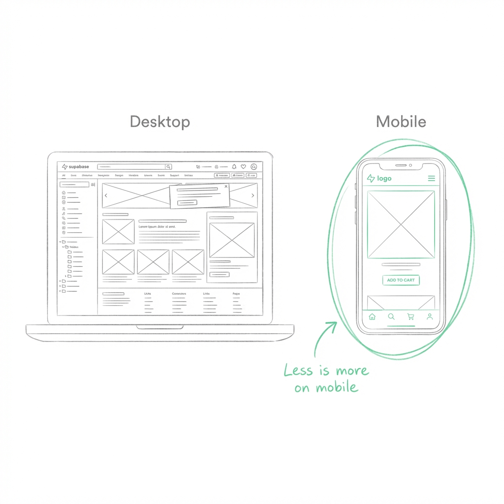
The mobile user does not want features. They want clarity and speed.
Step 5: Control JavaScript on Mobile Pages
Usually, the reason why the mobile page feels slow even after it loads is JavaScript.
Signs of JavaScript overload:
- Delayed taps
- Laggy scrolling
- Slow variant changes
- Add-to-cart delays
On mobile devices, even smaller scripts weigh more.
Best Practices:
- Load scripts only on pages where they’re needed
- Defer non-essential JavaScript
- Avoid heavy libraries for small interactions
- Remove scripts added by unused apps
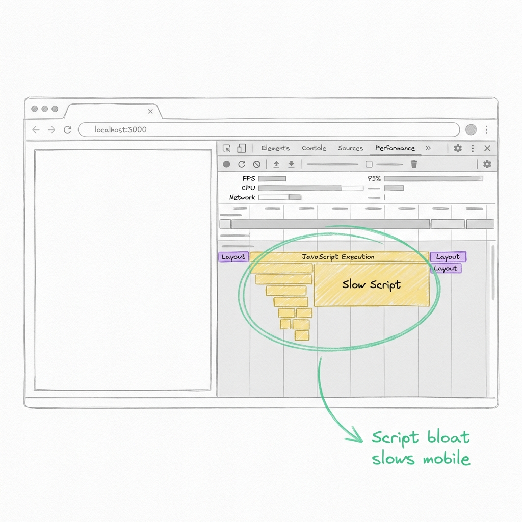
A page loading fast but responds slowly is not a mobile performer.
Step 6: Simplify Product Pages for Mobile Users
Product detail pages are where mobile performance matters most.
Common issues:
- Too many images are loading at once
- Big review widgets above the fold
- Sticky elements stacking on small screens
- Complex variant logic
Mobile-optimized product pages should:
- Load primary images first
- Push heavy sections below the fold
- Keep variant selection simple
- Prioritize fast add-to-cart actions
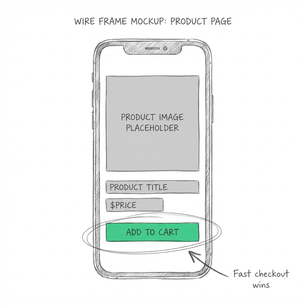
And if users are having problems with adding a product, nothing else matters.
Step 7: Optimize Fonts for Faster Mobile Rendering
Fonts are often overlooked, and they quietly slow down mobile pages.
Each font file adds:
- Network requests
- Render delays
- Potential layout shifts
For mobile:
- Limit font families to one or two
- Avoid loading unnecessary weights
- Use system fonts where possible
- Remove unused font files
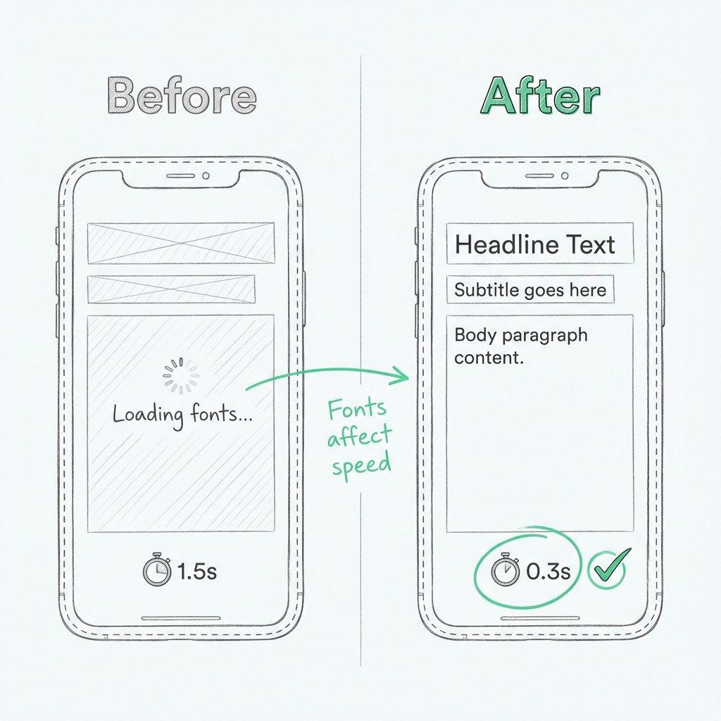
Optimized font loading can reduce mobile render delays by 200 – 400ms, which users definitely feel.
Step 8: Audit Apps With Mobile Performance in Mind
Apps are extremely powerful and very dangerous in terms of mobile speed.
Most of the applications inject their scripts onto every webpage, even when the feature isn’t used.
Regularly review:
- Which apps load scripts globally
- Whether features are mobile-critical
- Overlapping functionality between apps
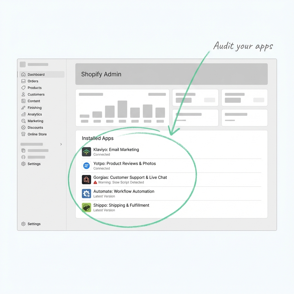
If an app doesn’t directly support mobile conversions or operations, it shouldn’t impact mobile performance.
Maintaining Mobile Speed as Your Store Grows
Even after doing an audit on apps and optimizing pages, performance can slow down.
Why? Shopify stores evolve:
- New apps get installed
- Marketing pixels are added
- Analytics tools, chat widgets, and personalization scripts accumulate.
Individually, these scripts are harmless. Together, they add to JavaScript execution, network requests, and render-blocking performance, which users feel most on mobile.
At this stage, performance-focused tools can help maintain mobile speed. They work alongside themes and apps to manage how scripts, images, and other resources load on mobile.
Common Shopify Page Speed Booster Apps
- Sonic Page Speed Booster: Optimizes storefront performance by preloading web pages, compressing images, generating image alt-text, generating schema markup, and reducing render-blocking resources. Helps maintain Core Web Vitals as apps and tracking scripts increase.
- Hyperspeed: Extreme Page Speed: Defers JS, optimizes assets, and accelerates page loads on pages with large themes and marketing suites.
- Swift Speed Optimizer: It offers caching solutions and script management with the help of lazy loading for improving the performance of the mobile version automatically.
- TinyIMG SEO & Image Optimization**:** Focuses on reducing image-heavy page size, which is especially useful for mobile product and collection pages.
These tools don’t replace proper optimization on mobile, but it helps maintain consistent performance when your Shopify store grows or changes.
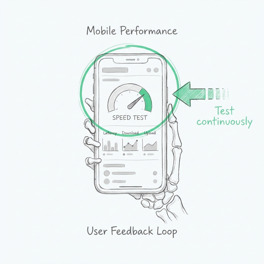
Step 9: Test Mobile Performance Continuously
Mobile optimization isn’t a one-time task.
Always test:
- After installing an app
- After theme updates
- Before ad campaigns
- After major design changes
Use a mix of:
- PageSpeed Insights (mobile view)
- Google Search Console Core Web Vitals
- Real-device testing
Metrics to watch:
- LCP < 2.5s
- INP < 200ms
- CLS < 0.1
Consistency matters more than perfect scores.
Wrapping It Up
Optimizing your Shopify store for mobile devices has very little to do with trying to get the fastest score or simply copying other ‘best practices.
It’s all about understanding how actual customers use your site on smaller screens and removing anything that slows them down, confuses them, or delays action.
The fastest Shopify e-commerce websites are not dependent on luck. They simplify, test, revise, and then repeat.
When mobile speed becomes part of your decision-making, improved conversions and reduced acquisition costs are likely to follow naturally.

About Gaurav Radadiya
I am co-founder of Adfinite, where we build eCommerce solutions for growth and efficiency. I build highly efficient automations for inventory management, order processing, logistics, returns management, product listing and marketing.